UPDATE: 9:45PM…Erik Lacitis at our news partner, The Seattle Times has made contact with both the artist who submitted the winning design and Envestnet for their reaction. You can see his story and their statements here.
UPDATE: 4:00PM…Received the following update from Meghan Pembroke at the City of Everett…
We’re in contact with the designer and will be discussing internally possible next steps.
UPDATE: 1:00PM…The City of Everett just released the following statement after our inquiry on the logo…
It’s been brought to our attention that the logo that was selected as the winning design in the City’s logo competition is similar to an existing company logo. All designers who participated in the contest signed an artist agreement confirming that their submissions were original and did not infringe on any other person’s copyright or service marks. The City is looking into the issue and will respond accordingly.
We’ll continue to follow-up. The original story was posted this morning. LD
Recently the City of Everett revealed the winner of its new logo contest. Here it is…
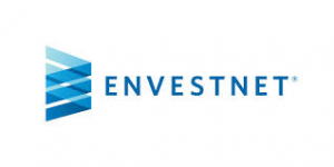
Today a reader sent MyEverettNews.com the following logo for a national financial advisory company Envestnet. Here is their logo…
We’ve reached out to both the City of Everett and Envestnet for their reaction to the resemblance. We’ll let you know what they say. Do you think Everett needs to go back to the drawing board?
[ad#Google 4]
December 10, 2014 at 6:01 PM
I voted… Not for this garbage. It says nothing for our city. It looks corporate. I voted for designs that show the personality of our city… Ones that represent our logging town history, our port, the natural beauty that we have here. Not some ugly random business logo. Its shameful that this actually won.
December 10, 2014 at 12:04 AM
I agree that the “agreed” logo is a flop and should reflect Everett and its beautiful surroundings. I also agree that they should go back to the drawing board and let the Everett citizens vote.
December 9, 2014 at 8:49 PM
RE-DO!!! Let Everett citizens vote for it and not some tasteless committee!
December 10, 2014 at 8:54 AM
It was voted on by the citizens.
December 9, 2014 at 2:31 PM
I agree that the design chosen is the exact same, only the colors changed. It does not represent Everett at all. I read the requirements of what they were looking for. Certainly there is something much more creative and exciting than what was chosen.
December 9, 2014 at 1:39 PM
I thought the design looked like a homeless/transient’s tent blown over.
So the DESIGN is perfect!
December 9, 2014 at 11:59 AM
I commented before that it looks like a piece of cake. I also think it has nothing to do with Everett, our history, the puget sound, or the Pacific Northwest. It is much too business like. And yes, it’s too close to the other logo, and the slight differences appear to be ‘on purpose’.
December 9, 2014 at 1:39 PM
I agree with you Dori. The logo is nice, even if it matches another company logo, but it did not even come close to fulfilling any of the requirements outlined for the logo contest. About the only thing it matched up with was the E in Everett – which wasn’t a requirement.
There were much better logos in the contest that truly represented the city and the region.