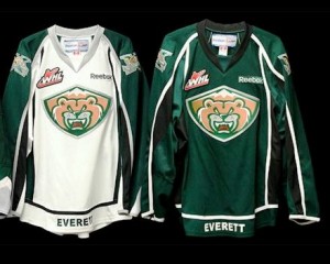
 The Everett Silvertips today revealed new jerseys and a new logo for their 10th anniversary. The new primary logo features a frontal view of the same Silvertip bear that has been the centerpiece of the team’s branding since its beginnings. The bear is set inside a background in the shape of a shield, which also incorporates the same mountains that have been used on the trim of Everett’s uniforms in previous years. Although it does not appear on the uniforms, the Silvertips have also introduced a new, more aggressive version of our secondary logo consisting of a swiping bear claw that forms the letter “E”. The concepts were designed by Keith Flynn of Flynnagain Productions.
“We wanted to use this opportunity of our 10th Anniversary season to put together a classic-looking logo and uniform that represents the Silvertips and our fans,” said Executive Vice President/Assistant General Manager Zoran Rajcic. “We’ve always been praised for our uniforms, and it was important to the organization during this two-year process to create a new dimension to our brand while staying true to our original look.”
You can click here to learn more about additional plans to mark the team’s tenth season in Everett.


August 10, 2012
Everett Sports